Event Poster
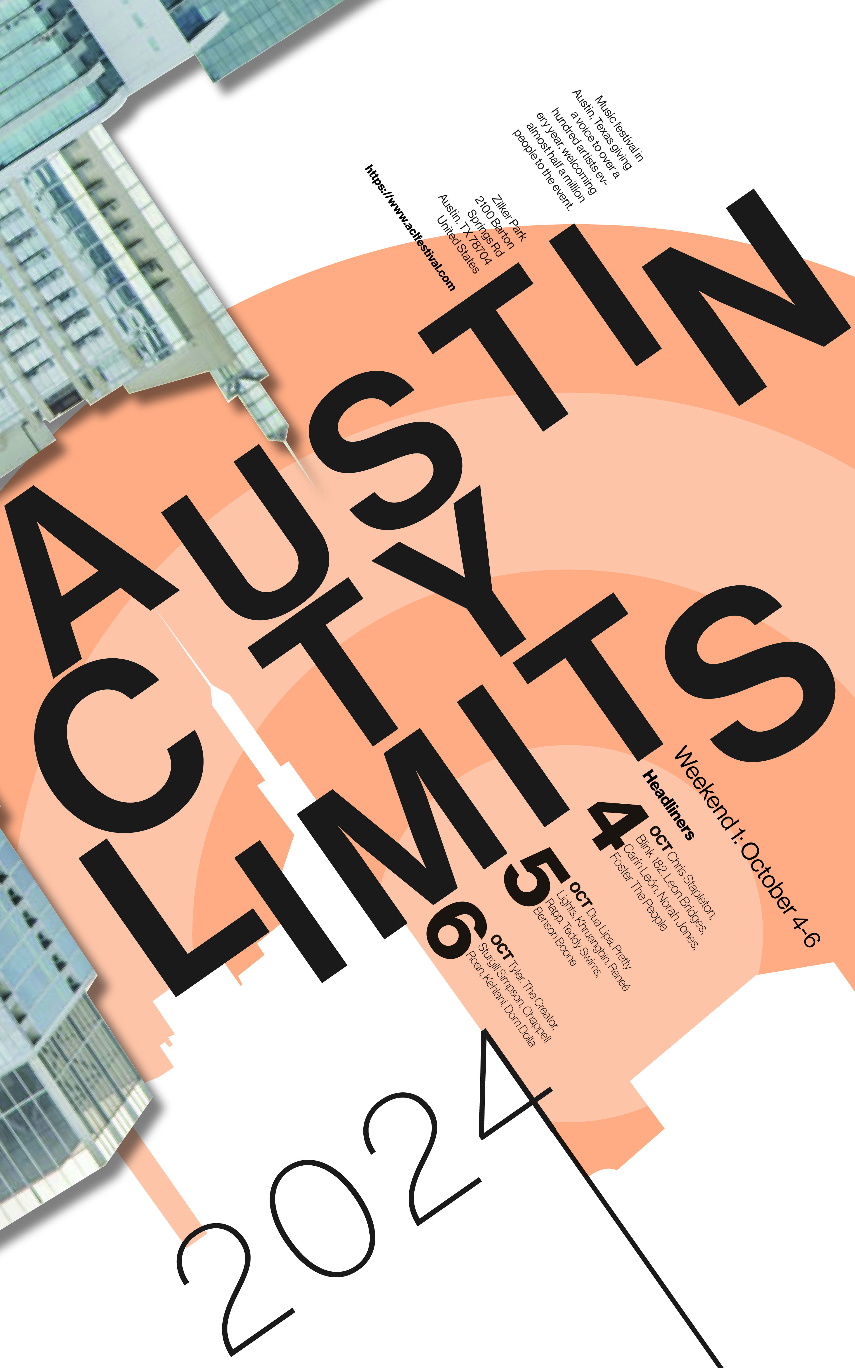
This was a school project brief to design a typography-led event poster, and I chose Austin City Limits as my subject. The concept was rooted in the physical experience of being at a festival, the energy, the movement, the sensory overload of running from stage to stage.
To capture that, I treated the typography itself as the main design element, mixing scale and case to make the letterforms feel like they were in motion rather than sitting static on the page. The Austin skyline was integrated directly into the type, with the city’s sharpest tower standing in for the I in City, a detail that ties the poster to its location without relying on anything generic. The concentric circle forms in the background were a direct reference to the flag designs ACL uses across the festival grounds, grounding the poster in the event’s own visual language for anyone who’s been there. The building photography layered behind the type adds texture and place, keeping the whole composition from feeling too flat or purely graphic.