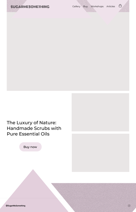
Chef Brand Identity System

Gourmet Journet is a food content creator centered on the experience of cooking and cuisine as a journey. The client needed a brand identity system that could establish a cohesive visual presence across digital platforms, something that felt personal and inviting, but with enough visual sophistication to stand out in the crowded food content space.
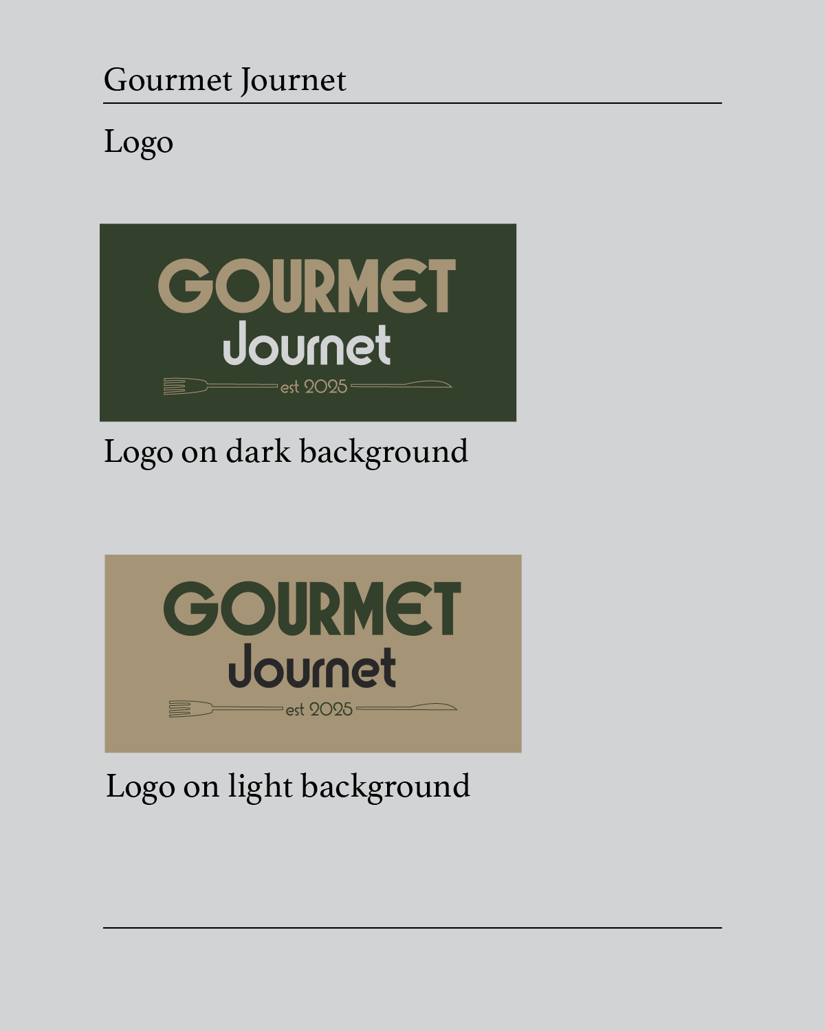
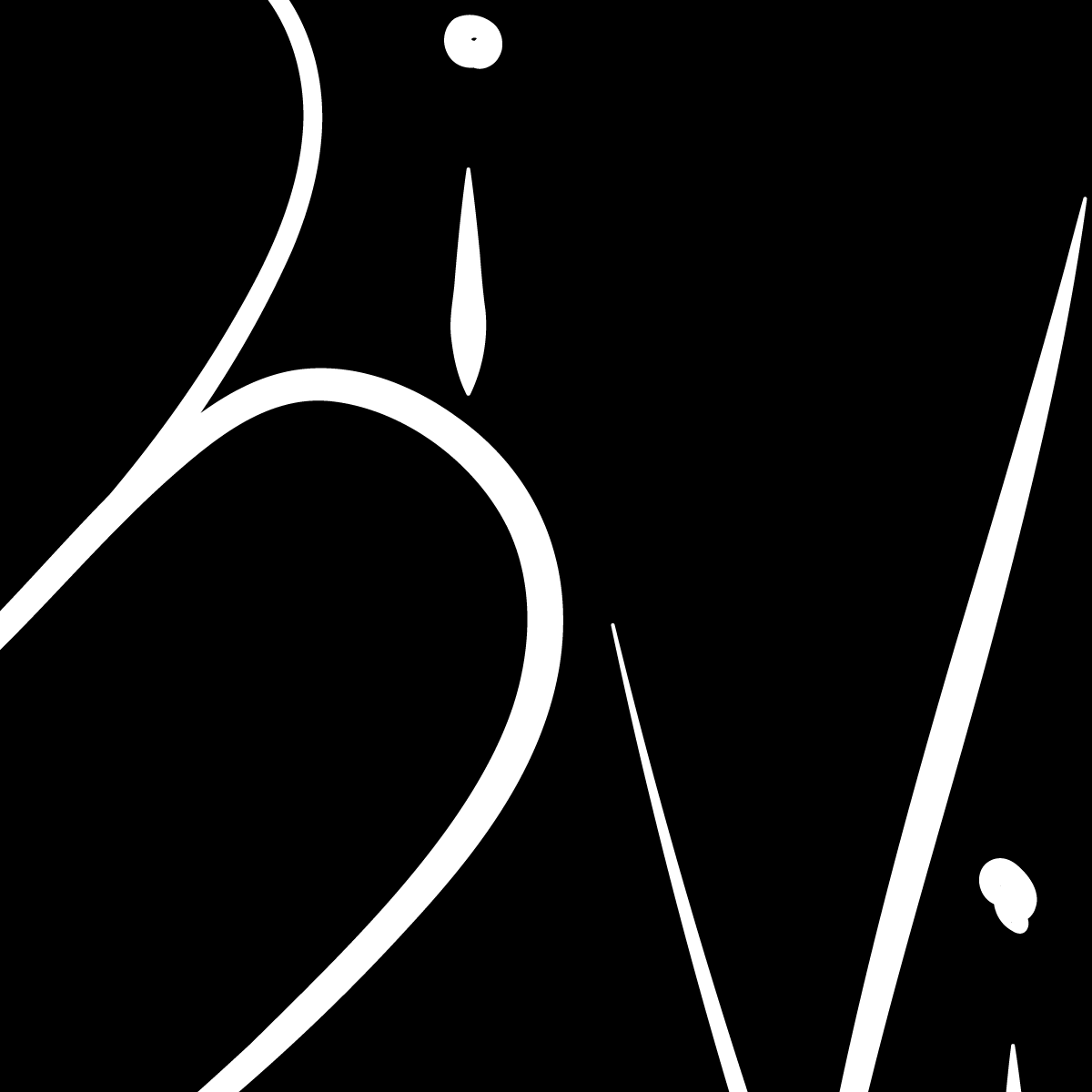
The client came in with a clear reference point: a warm, script-driven logo with a chef’s hat mark. The task was to honor that warmth while building a system around it that felt more considered and distinctive than the average food blog aesthetic.
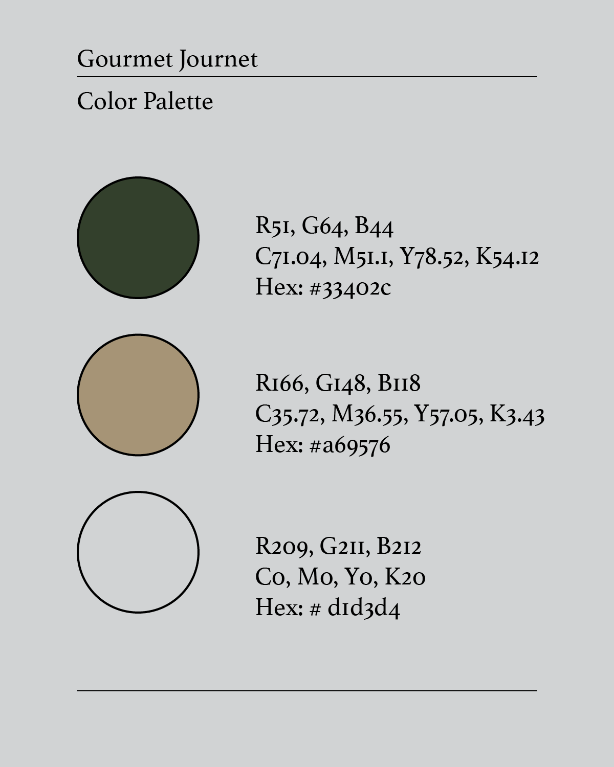
Working from the client’s mood board and inspiration, I developed a brand identity that retained the welcoming quality of their reference while grounding it in a more rustic, editorial palette. The three-color system moves away from the expected bright or saturated food brand colors in favor of something that feels earthy and intentional. The combination reads as both craft-forward and content-creator credible.
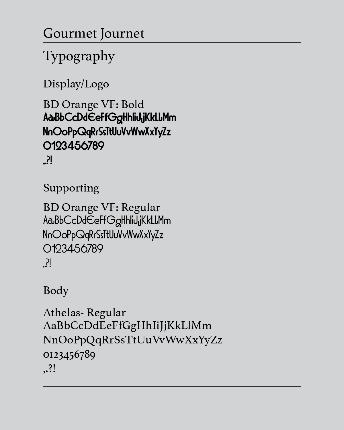
For typography, BD Orange VF anchors the system in bold display and readable body use, while Athelas Regular provides a classical, editorial supporting voice, reinforcing the sense that this is a brand with taste and perspective, not just recipes.