Matcha Truck Brand Identity System

Whiskin’ Matcha is a concept matcha truck created for a school project, designed to serve Houston’s college crowd. I came on to design the brand identity, and treated it the same way I would any real client brief. The brief was simple but the challenge wasn’t, the brand needed to feel fresh and culturally relevant to a young audience while still carrying enough personality to stand out in a crowded food truck scene.
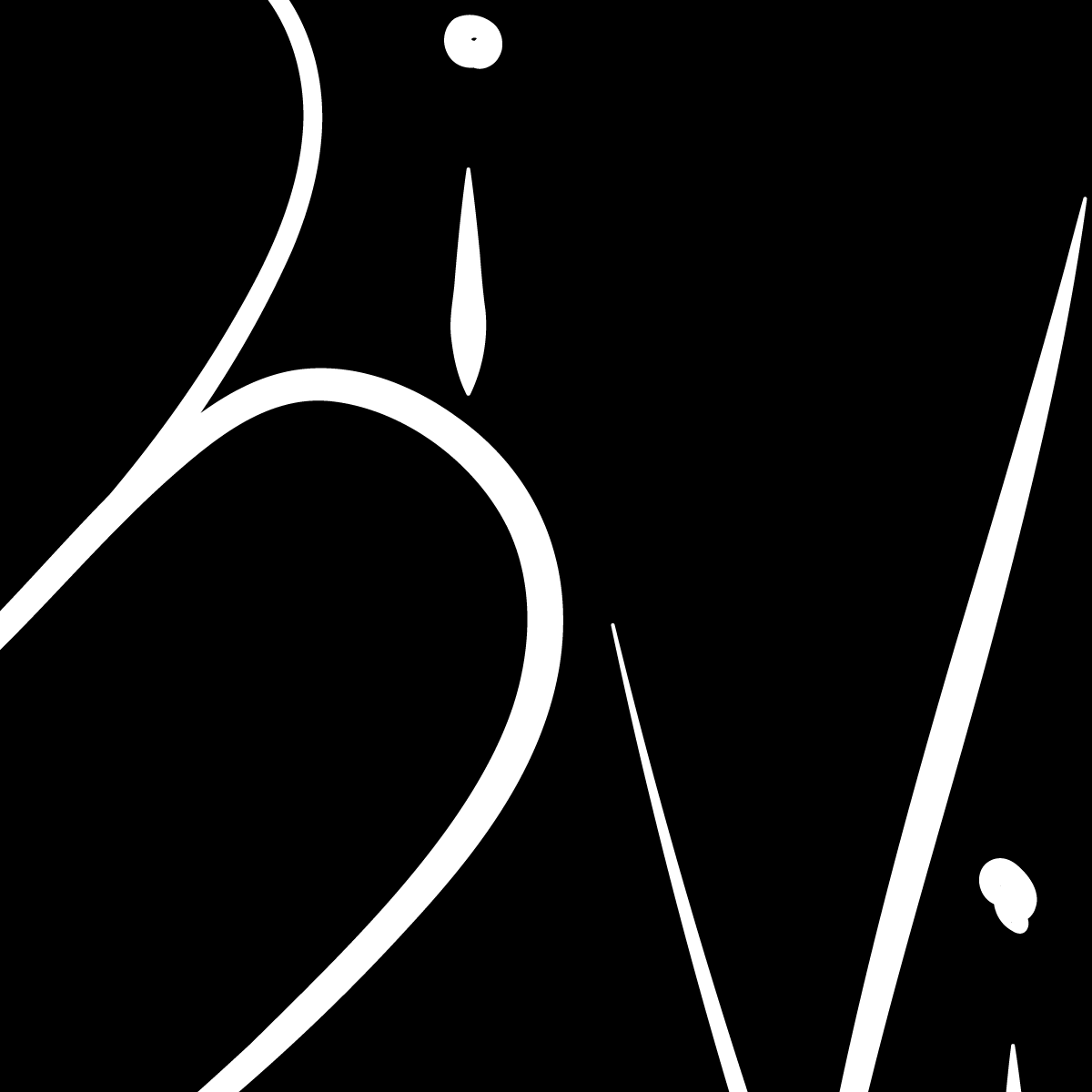
The result was a bold, type-driven mark built around a chunky retro-modern wordmark in Whiskin’ Matcha’s signature green. The defining detail was the Houston skyline embedded directly into the letterforms of “Matcha”, grounding the brand in its city without leaning on anything obvious or overused. The dark background and high-contrast green gave it an edge that reads well on packaging, social media, and the side of a truck alike. The goal was to make something that felt local and specific, but cool enough that a college student would actually want to wear it.