Fitness Brand Identity System
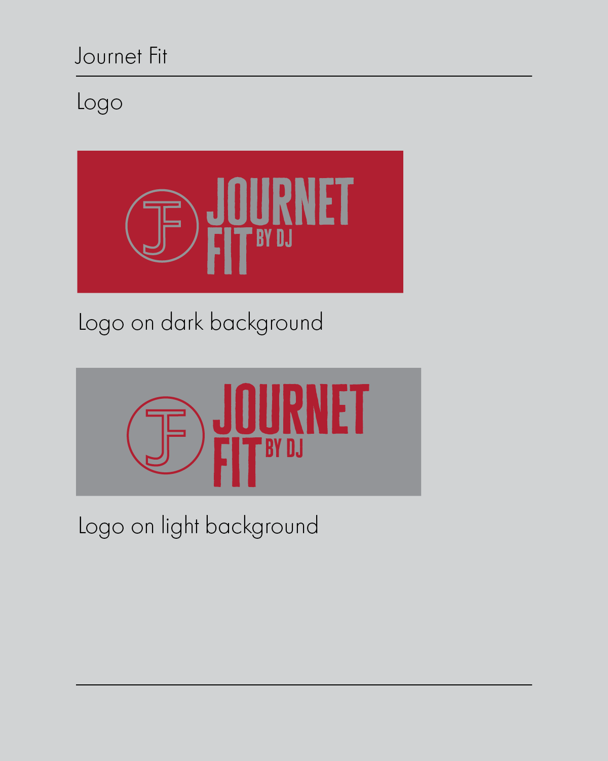
Journet Fit is a fitness content creator building a personal brand around health, movement, and an active lifestyle. The client needed a brand identity system that could establish a strong, recognizable presence across social media, something that felt credible in the fitness space while standing apart from the sea of generic gym aesthetics.
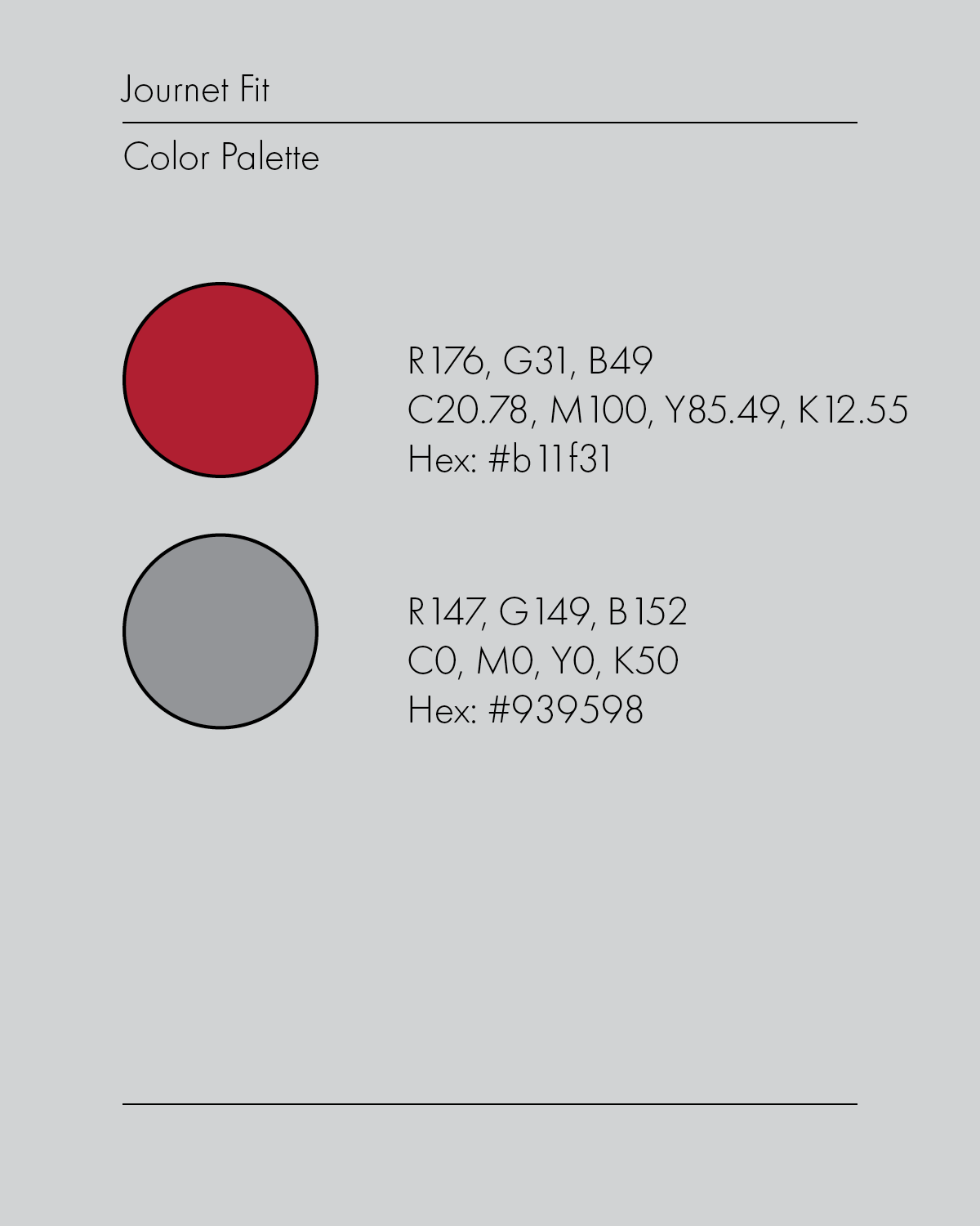
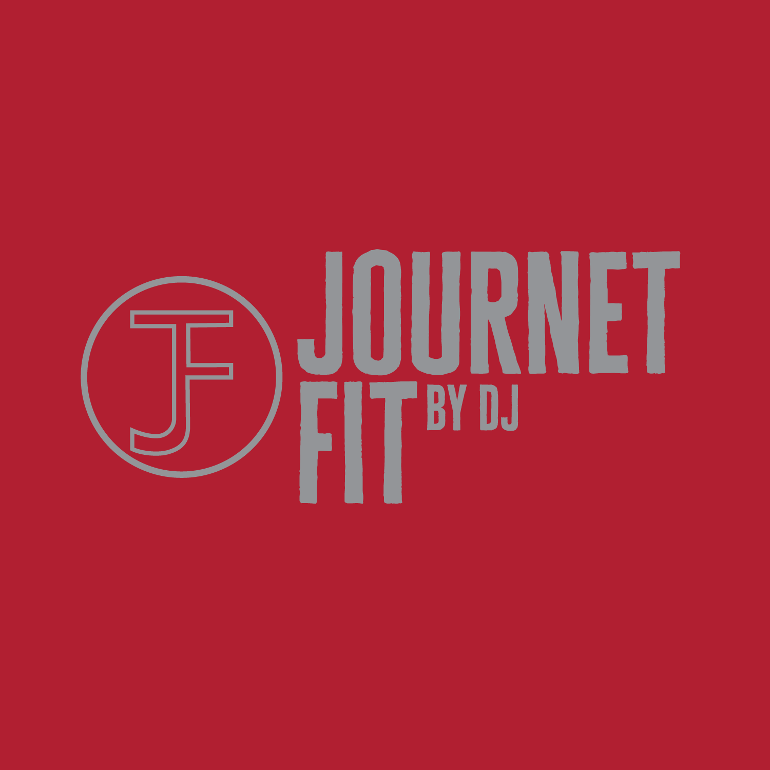
Working from the client’s vision of them wanting a sports team look, I developed a brand system built around that sports team sensibility. The two-color palette draws directly from the language of athletic branding, where strong color contrast signals confidence and competitiveness. The combination avoids the neon-heavy trend common in fitness content in favor of something that feels more like a franchise: timeless and structured.
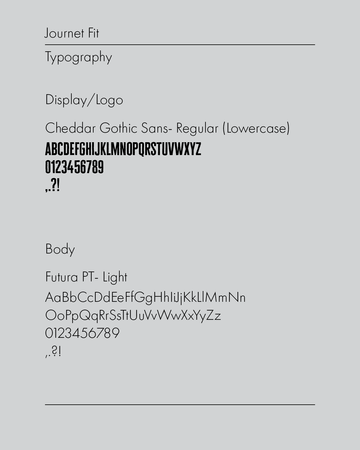
Cheddar Gothic Sans in lowercase anchors the display and logo treatment with a chunky, confident weight that reads immediately as sport-inspired without feeling generic. Futura PT Light in the body role provides a clean, modern contrast, keeping the system from feeling heavy while maintaining the athletic precision of the overall identity. The inclusion of a “by dj” sub-brand lockup within the logo system adds a personal signature element, reinforcing that this is a creator-led brand with a distinct voice behind it.