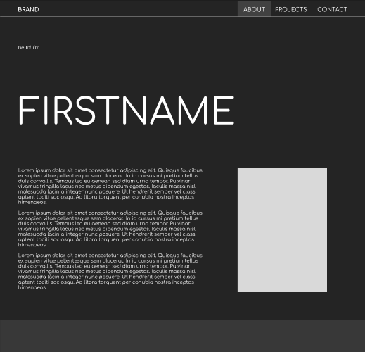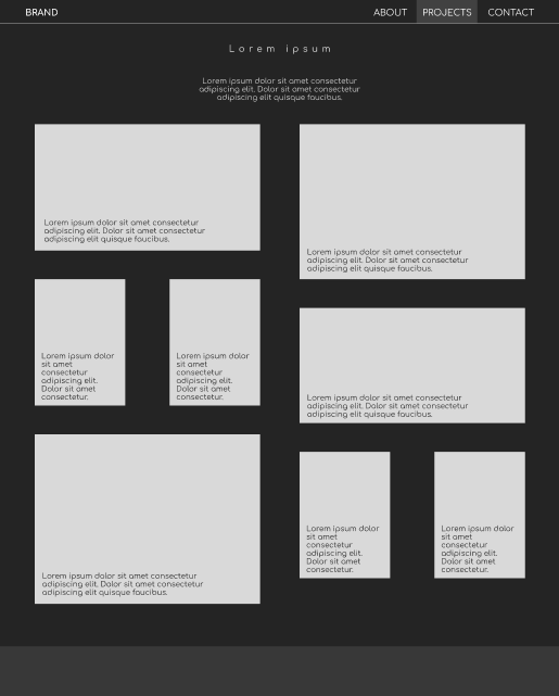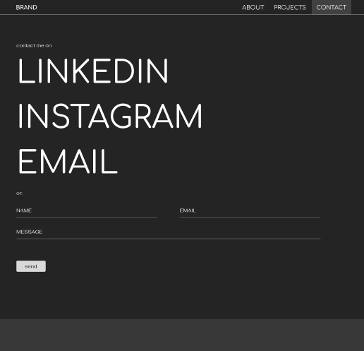
Concept Site Lo-Fidelity Wireframing
For a concept interior design portfolio site, I built out lo-fi wireframes covering the homepage, about page, projects index, and contact page.
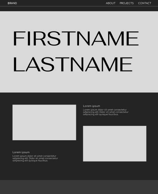
Without a real client brief to anchor it, I made the early design calls myself, landing on a dark, minimal aesthetic with oversized typography that felt more editorial than decorative. The direction was intentional: interior design portfolios often default to something airy and neutral, so leaning into a high-contrast, type-forward approach gave it more of a distinct point of view.
The layouts prioritized the work, keeping navigation lean and letting the project grid carry the visual weight.