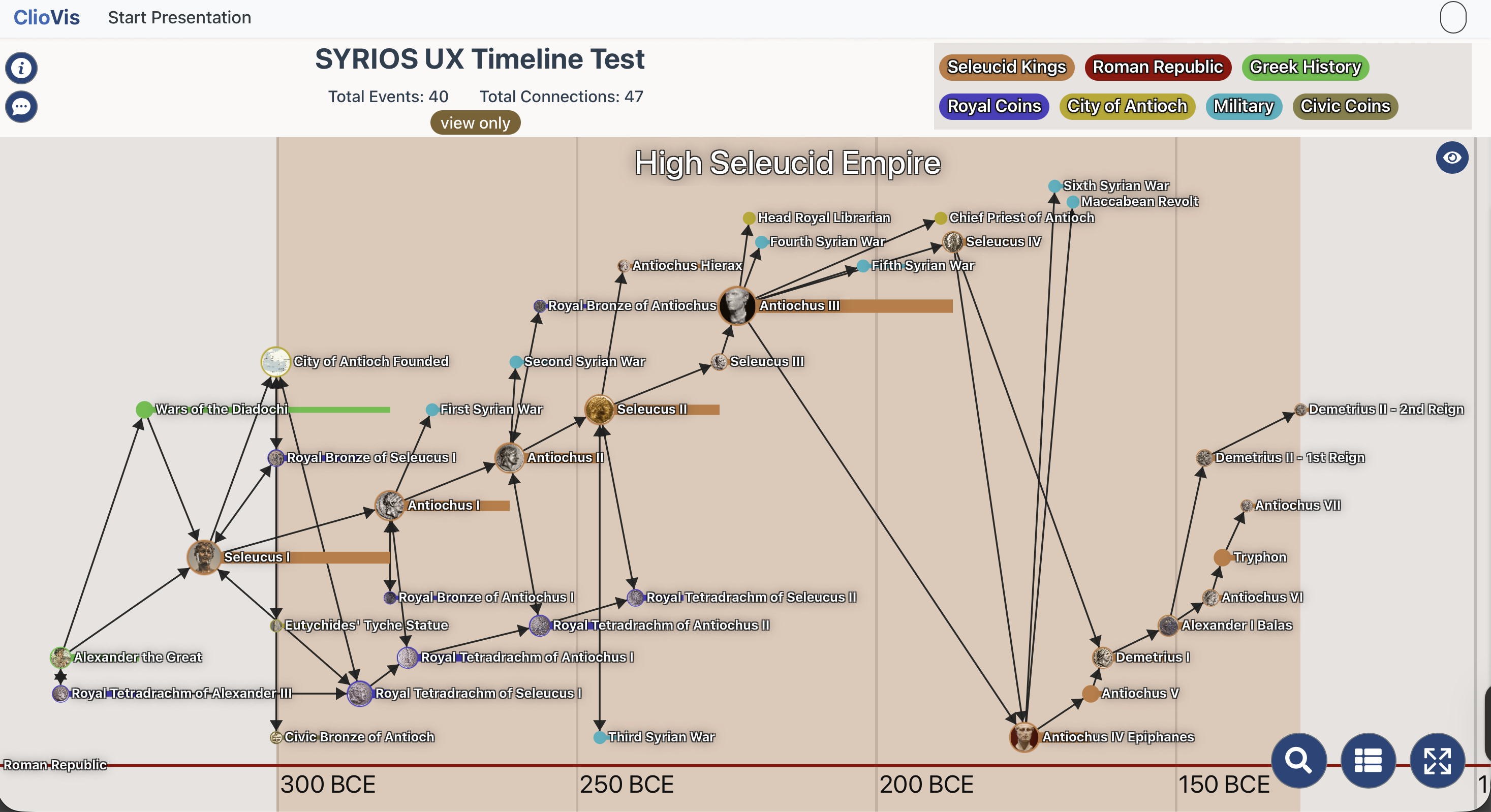
Translating Restaurant Brand Identity to Web

Working from a brand guide developed by Camille Nul, I further developed Hermies' visual identity by designing and building a fully interactive, multi-page site, translating the same visual language into a web experience.
Working within the established brand guide, the challenge was figuring out how each element should behave in a digital context: how the script wordmark scales in a nav, how the color palette holds up against photography, how much white space a menu page needs to stay legible without losing personality.
Each page was structured around a clear hierarchy, letting the photography lead and the typography support, keeping the experience warm and editorial throughout, from the homepage down to the loyalty program.